
THE PROBLEM
When Dab and Dew came to life, it wasn’t just another skincare label, it was a promise to make skincare fun, fresh, and fuss-free. But here’s the challenge: the Indian skincare shelf is packed with clinical white labels on one side and overly busy naturals on the other. Dab and Dew needed packaging that didn’t just sit quietly on a shelf , it had to call out to you, spark joy, and make you want to pick it up. The packaging had to educate without intimidating, feel premium without being distant, and stand out while staying true to its playful spirit.
THE GOAL
Our task was to create packaging that did more than hold a product,it had to hold a personality.
The goal was to make Dab and Dew instantly recognisable, approachable, and joyful. Each pack had to make skincare feel easy, like something you looked forward to doing, not another chore on your to-do list. It needed to speak to modern Indian consumers, educate them on ingredients, and still feel lighthearted enough to put a smile on their face.
THE SOLUTION
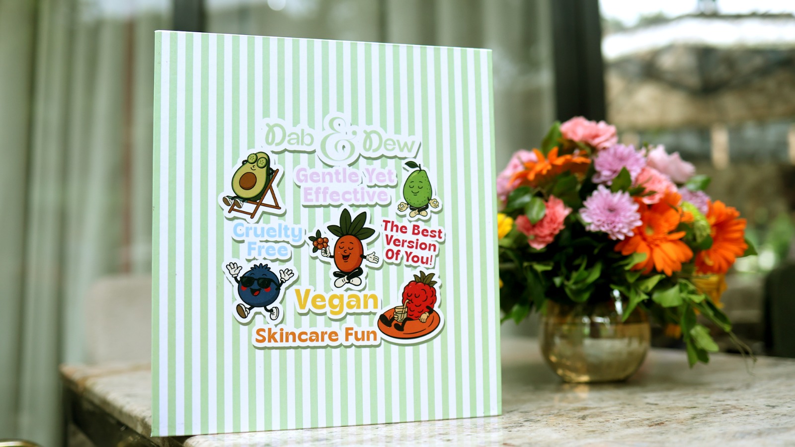
We started with a simple question: what does joy look like on a shelf?
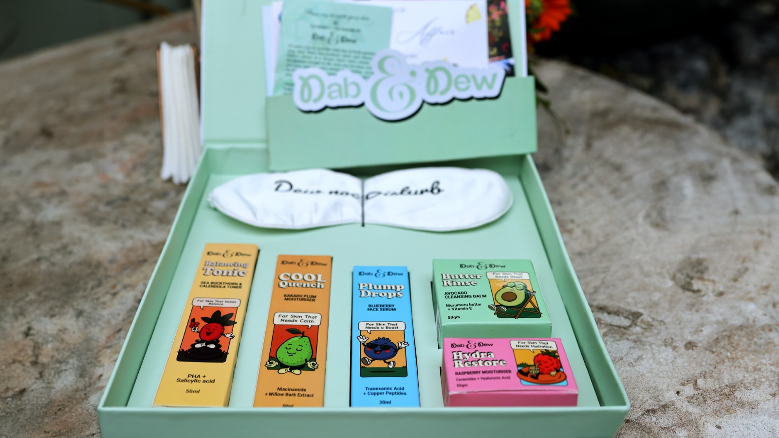
The answer became the foundation of Dab and Dew’s packaging design. We combined vibrant, fruit-forward colours with clean, minimalist typography to create a look that was equal parts playful and polished. Each pack was treated like a story from the front panel that instantly tells you the product’s “skin mood,” to the back panel that gently explains the science without overwhelming you with jargon. Textures and finishes were chosen to feel soft and sensorial, echoing the experience of using the product itself. Every design decision from colour palette to copy was made to make the consumer feel cared for and delighted, as though the packaging was smiling back at them. The result was packaging that didn’t just look good in your hand it made you feel good holding it. It told you what you needed to know, reassured you with its simplicity, and invited you to make skincare fun again.
THE IMPACT
Dab and Dew’s packaging quickly became its strongest silent storyteller. It helped the brand claim its space on the shelves and online with a visual identity that was unmistakably its own. Consumers didn’t just buy a product, they felt connected to a brand that spoke their language and understood their skin’s moods. For us, this project was proof that design can do more than catch the eye, it can start a conversation, make someone smile, and turn a product into an experience.